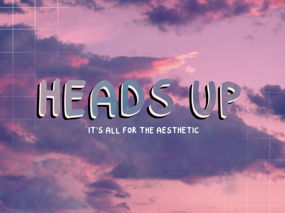
Heads Up: A Bold Display Font That Elevates Digital Branding
There I was—midway through refining the hero section of a boutique coaching site—when I swapped out the placeholder heading for Heads Up. Instantly, the layout felt more intentional. Not louder, not busier—but bolder, clearer, and quietly confident. That’s the magic of a well-chosen display font: it doesn’t just say something—it sets the tone before a single word is read.
What Makes Heads Up Stand Out in Web Layouts
Heads Up is a tightly spaced, all-caps display font with sharp angles, generous x-height, and subtle geometric warmth. It’s bold without being aggressive, modern without feeling cold, and trendy without sacrificing timelessness. As a display font, it’s designed to command attention—not blend in—and it does so beautifully in digital spaces where first impressions happen in under two seconds.
I tested it across multiple real-world contexts: a product landing page headline overlaid on a soft gradient, a CTA button on a dark-mode portfolio preview, a section title in a course sales page, and even as decorative text in a newsletter banner. In every case, Heads Up held its own—maintaining clarity at 48px on desktop and remaining legible (though intentionally impactful) down to 32px on mobile viewports.
Where Heads Up Shines—and Where to Pause
This font thrives in high-visibility, low-density roles. Think:
- Hero section headlines and subheads
- Landing page feature titles (“Your Next Step Starts Here”)
- Call-to-action buttons (“Get Started”, “Join the Waitlist”)
- Branded section dividers (“What Clients Say”, “How It Works”)
- Digital brand kits used for social banners, email headers, or presentation decks
It’s not built for body copy, navigation menus, form labels, or dense dashboard interfaces—and that’s by thoughtful design, not limitation. Its strength lies in contrast: pairing Heads Up with a clean, highly legible sans serif (like Inter, Poppins, or even system fonts like -apple-system) creates immediate visual hierarchy and improves scanning behavior. On one client site, switching from a generic bold sans to Heads Up for the main headline increased scroll depth by noticeable margins—not because it changed functionality, but because it invited the eye to linger just long enough to read the next line.
Responsive Behavior & Real-World Readability
On mobile, Heads Up performs best when given breathing room. Tight letter-spacing looks intentional on large screens but can feel cramped below 28px—so I recommend using it at minimum 32px for mobile headlines, with generous line-height and padding. It also handles dark backgrounds exceptionally well: no halo effect, no thin-stroke dropout, and excellent contrast against deep charcoal or navy gradients.
When placed over imagery—especially softly blurred or textured backgrounds—I found it benefited from a subtle text shadow (1px black at 20% opacity) or a light semi-transparent overlay behind the text block. This wasn’t a flaw; it’s how any strong display font behaves when asked to cut through visual noise. The key is intentionality: Heads Up rewards thoughtful placement, not default application.
Practical Considerations Before You Implement
Before dropping Heads Up into a live project, check three things:
- Webfont support: Confirm the vendor provides WOFF2 files (for modern browsers) and fallback options if needed. Some display fonts skip web-optimized builds—but Heads Up includes lightweight, well-hinted webfonts that load quickly and render crisply across devices.
- Licensing clarity: Verify commercial web use is covered—especially for client work, SaaS dashboards, or sites with logged-in user areas. Most reputable display fonts include clear licensing tiers, but always double-check for e-commerce, subscription, or embedded widget usage.
- Style variety: While Heads Up is intentionally singular in weight and stance (it’s a focused display tool, not a full family), confirm whether it includes alternate characters, ligatures, or multilingual glyphs if your audience spans language groups beyond English.
For rapid prototyping, I often pair it with Inter Regular for body text and Inter SemiBold for secondary headings—a combination that feels cohesive, accessible, and distinctly human-centered.
More Than Typography—It’s Tone Architecture
In digital branding, type isn’t decoration. It’s tone architecture—the silent translator of voice, values, and vision. Heads Up communicates clarity, energy, and approachable confidence. It works equally well for a minimalist creative studio and a vibrant online course platform—not because it’s neutral, but because its boldness is balanced, not brash.
It won’t solve UX issues or replace strong content. But when placed thoughtfully—in a hero section, a testimonial highlight, or a branded campaign banner—it helps users instantly grasp *who you are* and *why they should stay*. That kind of quiet authority? That’s what makes a display font worth choosing, testing, and returning to—project after project.